3.5 I can adjust settings so that others can access IT tools and devices for
collaborative working.
1. Why should the following colours not be used together when creating your website - red and green or 2 primary colours?
the primary colors because it looks childish and no one would be interested in reading the what is in the website.
2. Why is it better to use labels such as “continue” or “stop” rather than a green or red coloured button on your website?
Because some people are colour blind so the will not be able to see the colors green and red however some people dont know what the colours green and red stand for, so i think it should only be written "continue" or "stop".
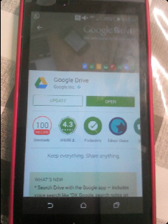
3. Take a photograph of you accessing G Drive on your mobile device. Be careful not to share any personal information on your photograph.
the primary colors because it looks childish and no one would be interested in reading the what is in the website.
2. Why is it better to use labels such as “continue” or “stop” rather than a green or red coloured button on your website?
Because some people are colour blind so the will not be able to see the colors green and red however some people dont know what the colours green and red stand for, so i think it should only be written "continue" or "stop".
3. Take a photograph of you accessing G Drive on your mobile device. Be careful not to share any personal information on your photograph.